Visualisation
Add column container widget
- Open the Blocks palette containing gui widget elements by clicking its icon on the bar in the upper right corner.
- Drag the Column container widget to the canvas.
- The new widget is displayed as a dashed rectangle containing another rectangle representing one column.
Resize column container
- Select the Column container widget on the canvas by clicking on it, so that the resize points appeare. Drag down the resize point in the middle of the bottom side to extend the container.
Add column widget
- Drag the Row/Column widget into the column container to add second column.
Set flex-basis for both columns to 50%
- Select one of the columns by clicking into it.
- Open the Style Manager by clicking its icon on the bar in the upper right corner.
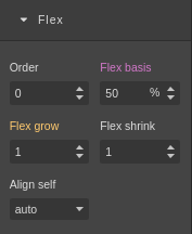
- Expand the Flex tab.
- Set the Flex basis to 50%.
- Repeat all of the steps for the other column also.
- Each of the two collumns should now span equaly over half of the Column container component.

Add chart to left column
- Switch to the blocks palette.
- Drag the Chart widget from the palette to the left column.
Add dataset for the cosinus to left chart.
- Select the new Chart widget on the canvas.
- Name it "Cosinus" in the "Name" text box in the right column.
- Choose "Line chart – Plot.ly" in the "Chart type" selector.
- Expand the "Datasets" tab.
- Click "Add dataset".
- Expand the "Dataset" sub tab.
- Name the dataset "cosinus" in the dataset "Name" text-box.
- Click the dataset button of the y axis dataset with "none" text.
- Select the variable "Lissajous:cosinus" in the popup window list.
- Click preview in the left menu. You should have a working cosinus chart.
Set maximum samples for the chart
- Set "Maximum samples" to 200 in the cosinus dataset tab. When the limit is reached in the plot, the curve starts to slide to the left. -1 mens there is no limit.
The project in this stage may be downloaded here and the simulator is:
